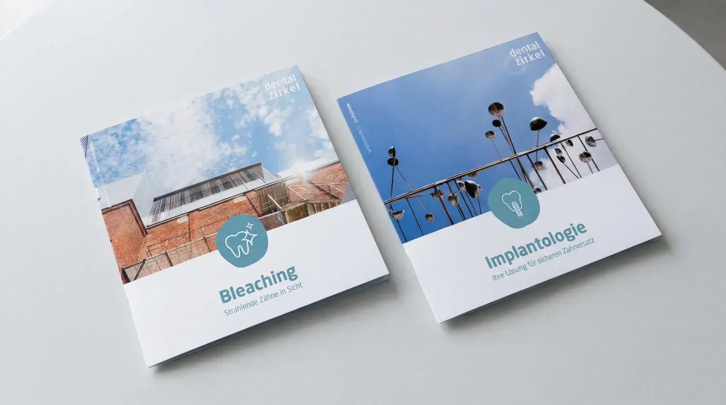
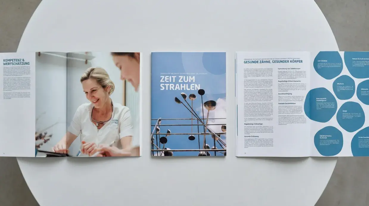
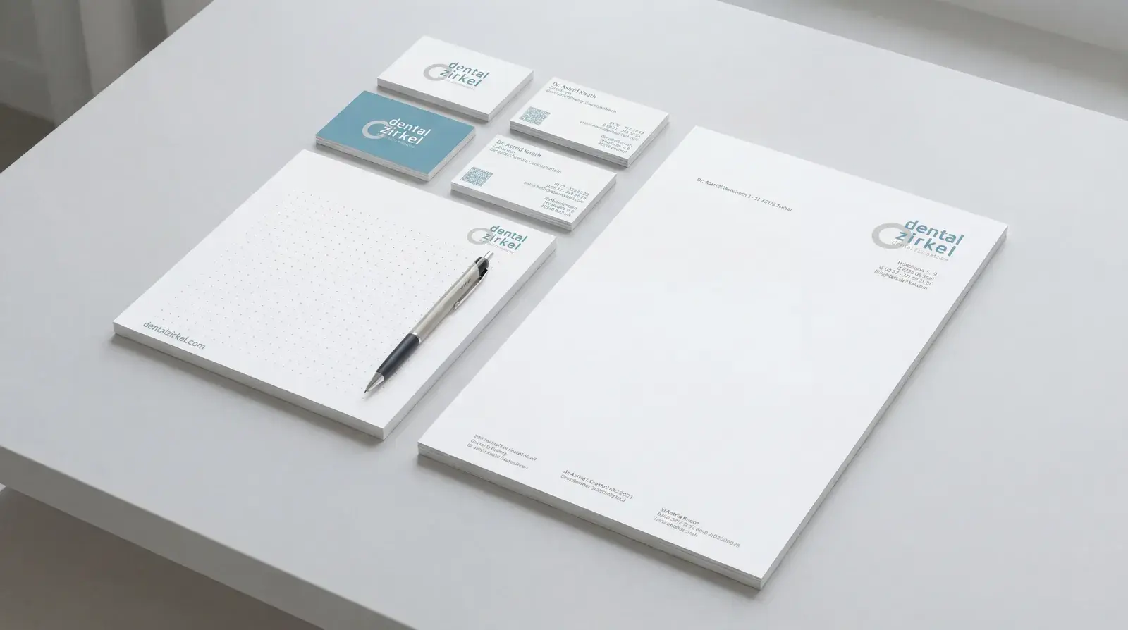
From naming and logo to business equipment, from interior design to website: everything fits together. A precise design system that radiates professionalism and yet remains approachable. With local photo motifs, soft colors and well-thought-out details, a brand is created that creates trust – at first glance and beyond.
Together with the founder team, we went deep: what makes a good practice? What do people feel before they come for treatment – and how does it feel when you go back out?
From this emerged: dentalzirkel. A name that radiates reliability – but doesn't look stiff. A branding that shows a clear edge – but still remains inviting. And a visual system that breathes just as calmly as the practice itself.
Design to feel good – thought out to the last corner.
What looks good on paper must work in everyday life. For dentalzirkel, we therefore not only designed a logo, but created a complete brand world – with substance.
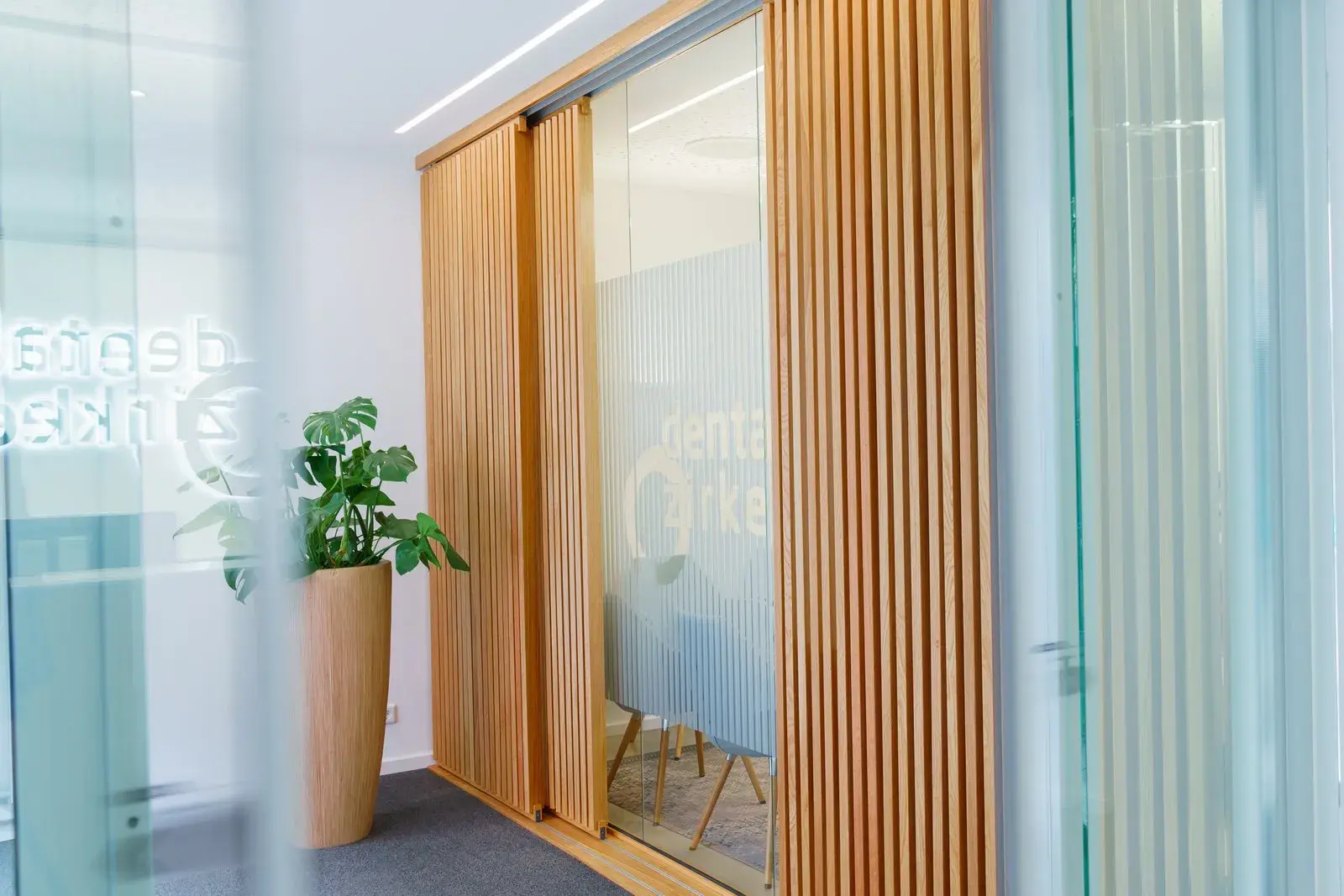
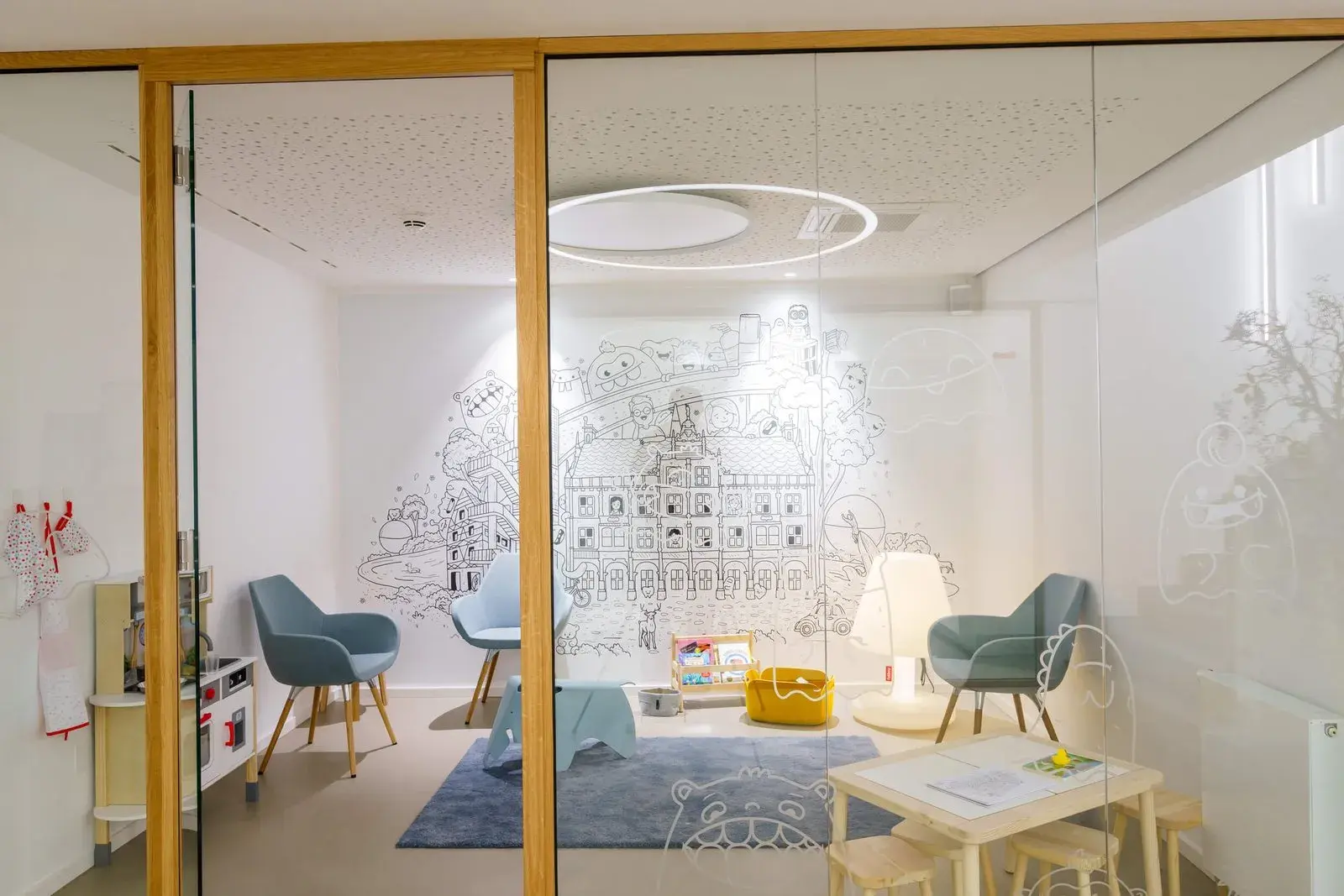
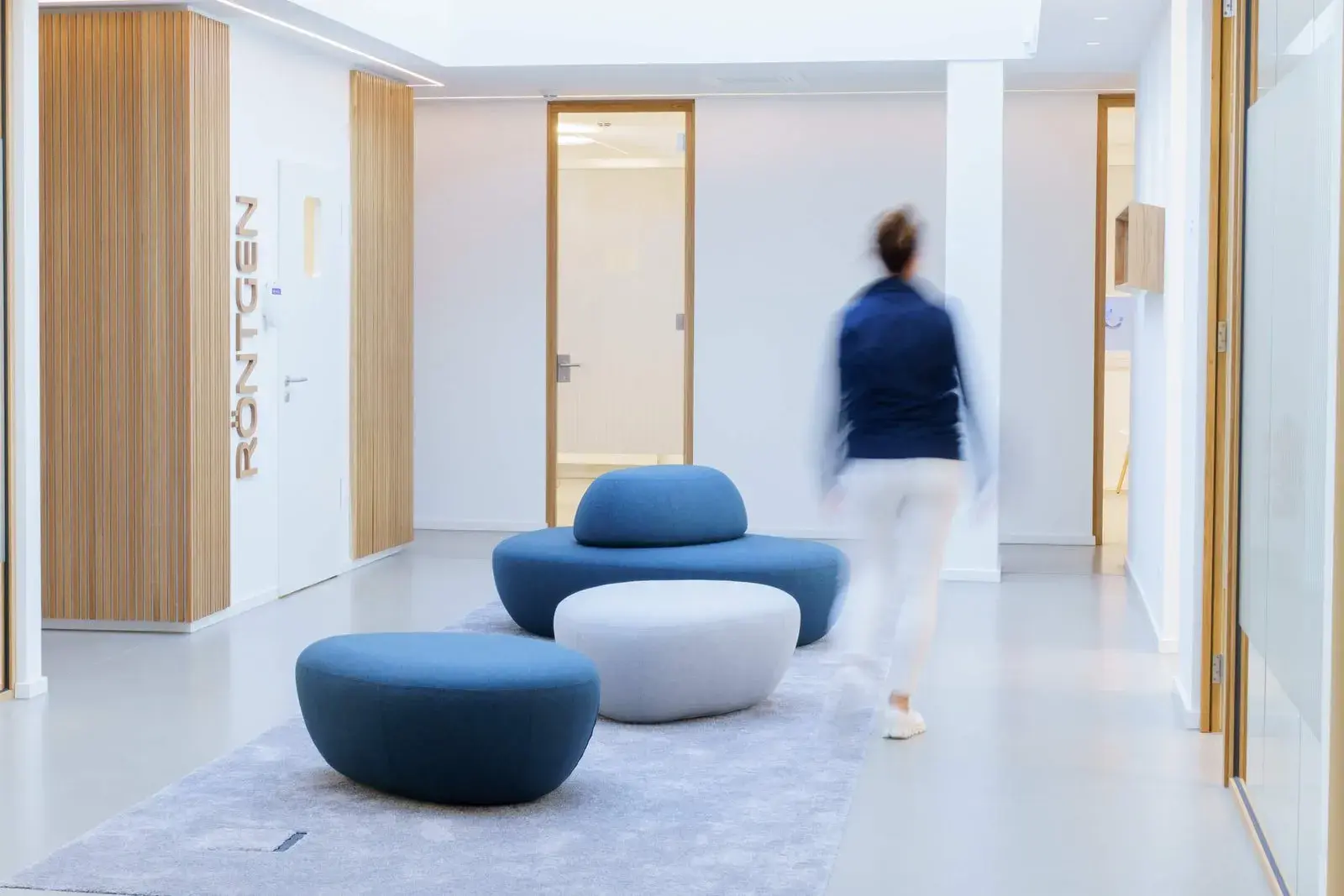
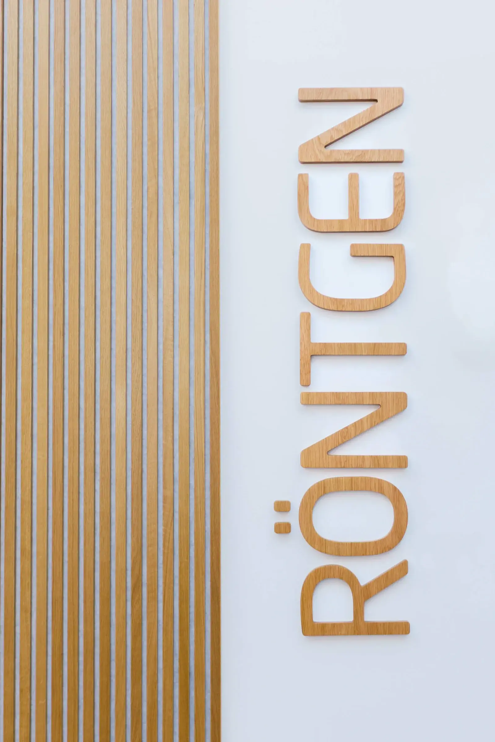
From the door sign to the appointment card, from the room graphics to the Instagram post: everything follows a system. Recognizable, consistent, honest.
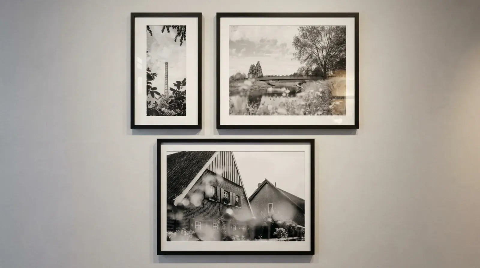
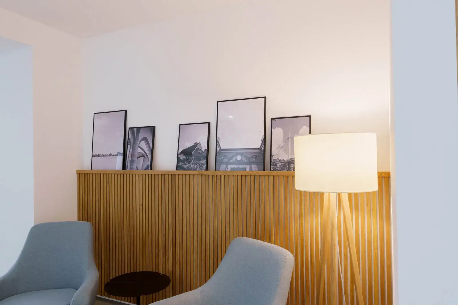
The visuality refers to the city of Bocholt – in the form of specially made city photos that act as art in the room without being intentionally decorative.
The color world is calm, friendly, sovereign. The typography clear, but not cool. The result: an appearance that creates trust without demanding it. No chi-chi. No platitudes. Simply a practice that looks as it is: professional, personal – and ready for a new generation of patients.